

Brand Identity for a Marketplace with a Mission
Role:
Brand Identity, Creative Direction
Deliverables:
Logo System, Visual Identity, Color Palette, Brand Assets, Merchandise, Website Concepts
Overview
AnthroTerra set out to make charitable giving feel like a natural part of everyday shopping. Rather than asking people to purchase merchandise solely to support a cause, the platform envisioned a marketplace where consumers could buy products they already wanted while directing a portion of every purchase toward carefully vetted nonprofit organizations.
The challenge was creating a brand that felt optimistic and trustworthy without leaning into the visual clichés often associated with sustainability or nonprofit organizations.
The Challenge
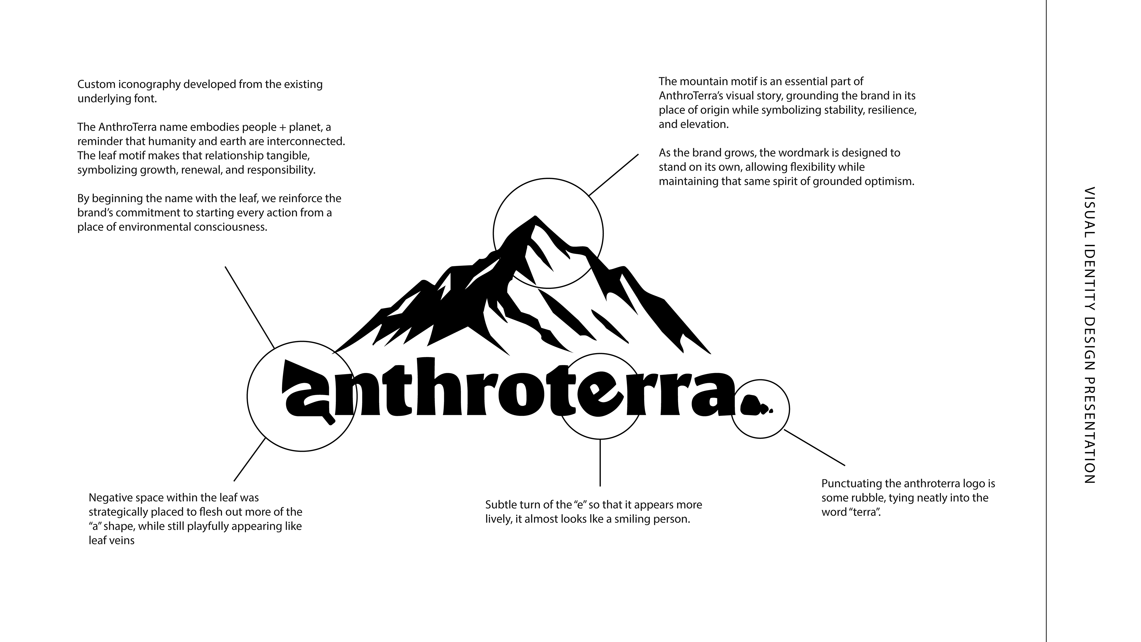
The original identity explored a variety of visual directions, including mountains, forests, globes, and symbolic human imagery. While each reflected part of the mission, the overall brand lacked cohesion, scalability, and a recognizable visual language.
The goal was to create an identity that could feel equally at home on a website, clothing label, product packaging, social media, and a mobile app while remaining approachable, memorable, and easy to reproduce across physical and digital environments.
Brand Direction
Rather than designing around environmental symbolism alone, I focused on the bigger idea behind the company: every purchase becomes a small act of positive impact.
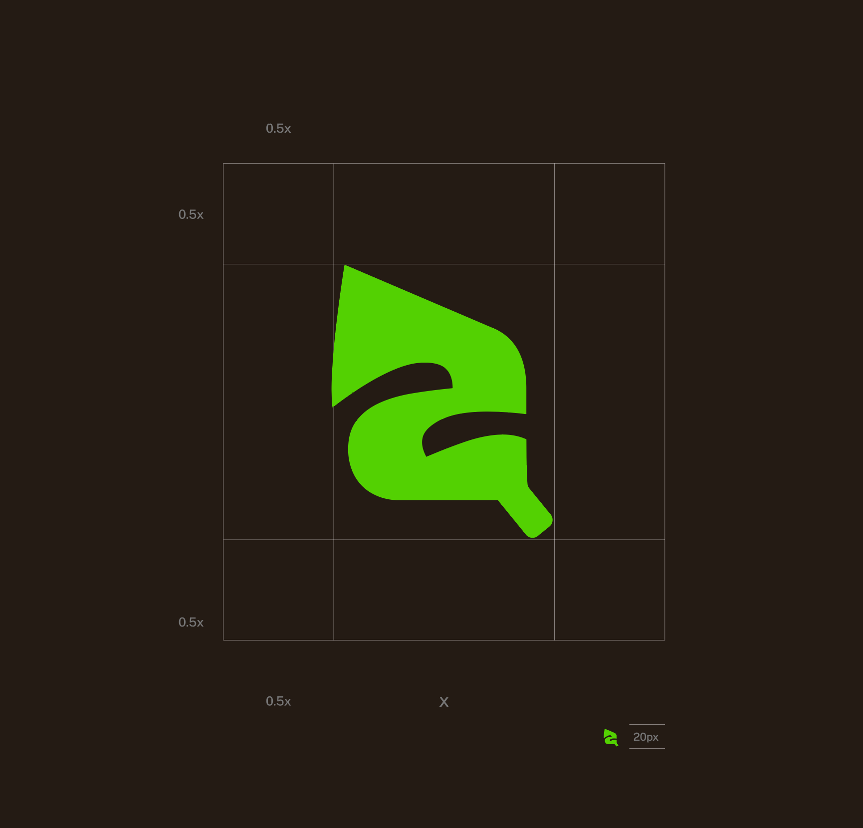
The identity balances soft organic forms with bold typography to create something that feels modern, optimistic, and approachable. Earth-inspired colors reinforce the mission without becoming overly rustic, while the simplified icon system allows the mark to scale from website navigation to apparel tags and packaging.
Every design decision was made with flexibility in mind, creating a system rather than a single logo.
Bringing the Brand to Life
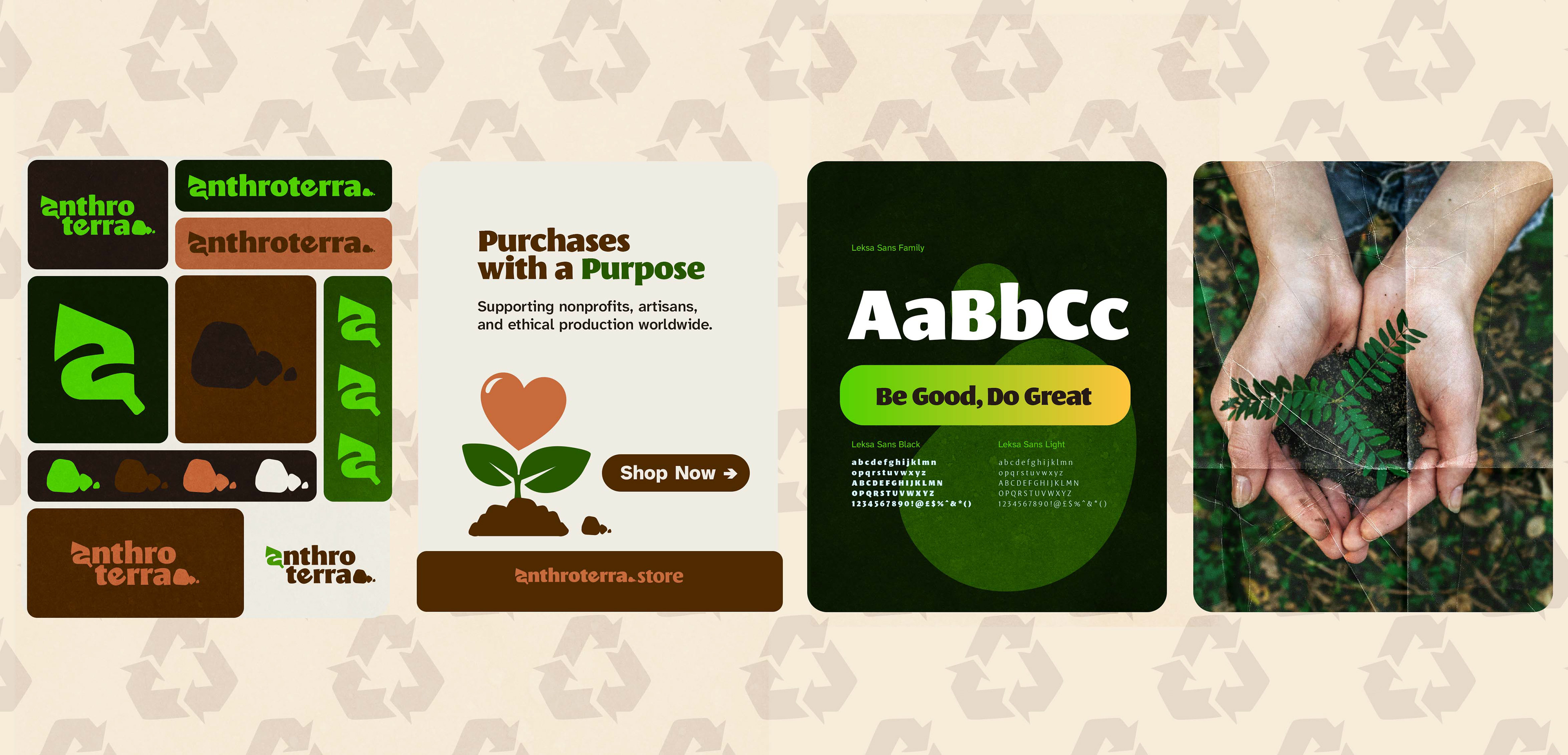
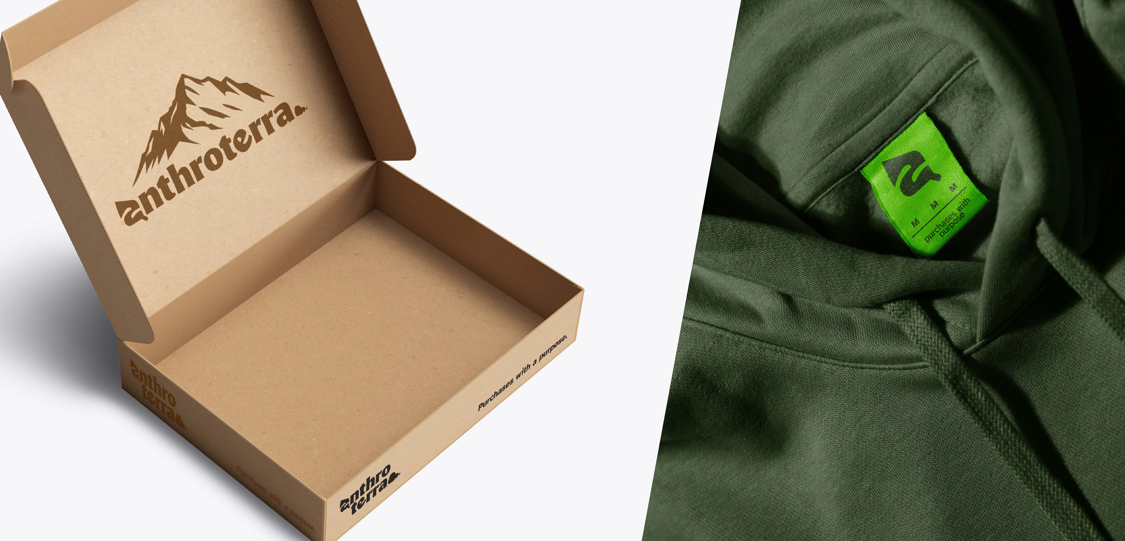
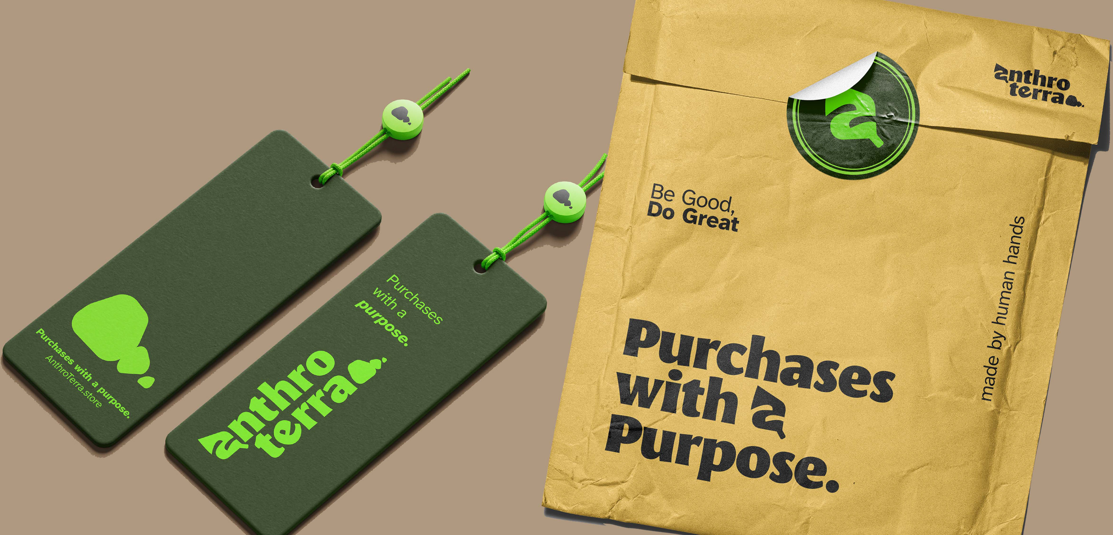
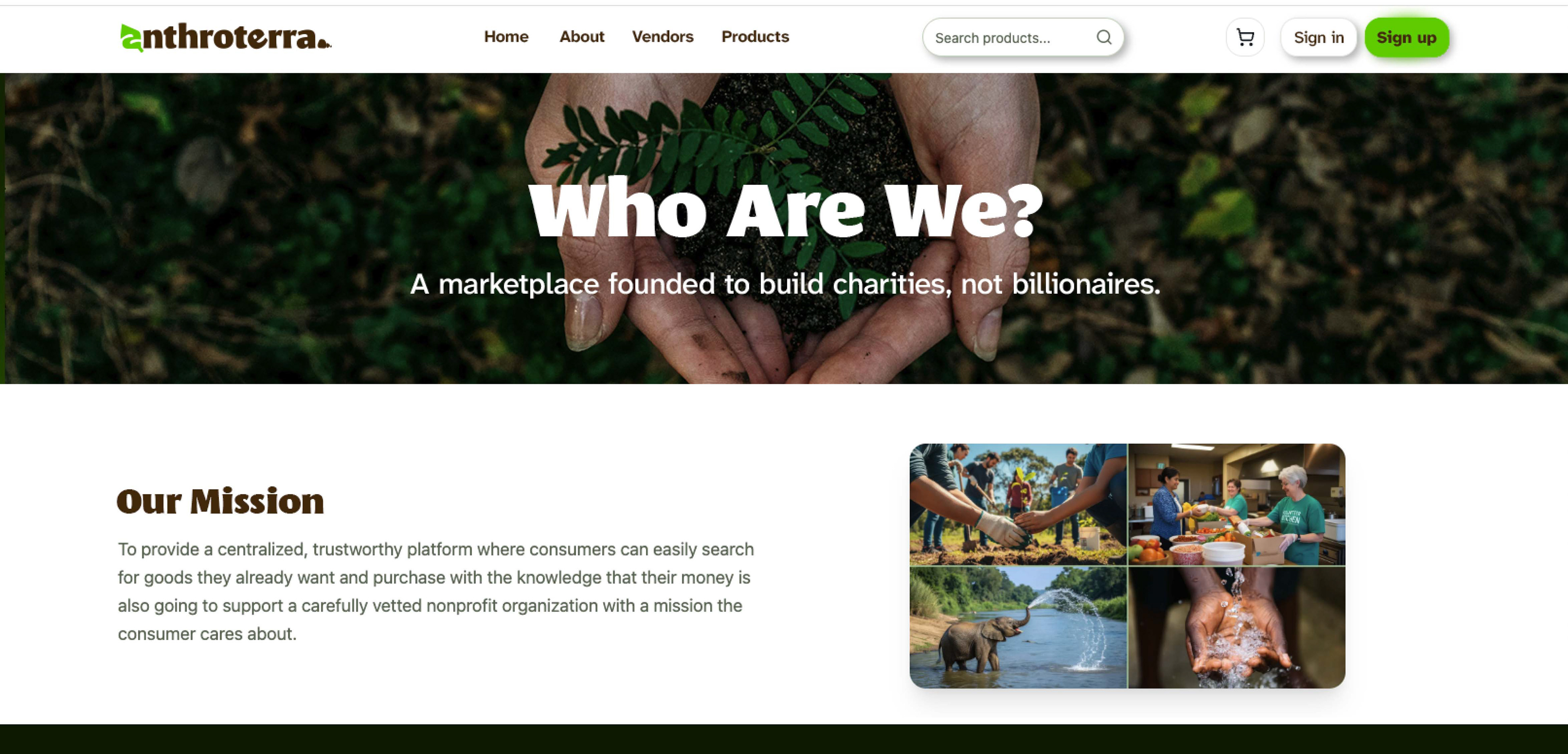
Once the visual identity was established, I expanded it across a variety of customer touchpoints to demonstrate how the brand could live beyond a logo.
This included merchandise, apparel, shipping materials, marketing graphics, website concepts, and promotional assets that maintained a consistent visual language while adapting naturally to different formats.
The result is a brand system designed to grow alongside the business rather than requiring reinvention as the company expands.
Reflection
One of my favorite parts of this project was balancing purpose with usability. Mission-driven brands often rely heavily on visual symbolism, but long-term recognition comes from consistency more than complexity.
AnthroTerra became an exercise in restraint; creating an identity that feels warm, modern, and optimistic while leaving room for the stories of the nonprofits and communities it exists to support.