

Mudlark Assembly
Brand Identity Exploration
Role: Brand Strategy · Visual Identity · Art Direction
Overview
Mudlark Assembly is a concept brand for a community pottery studio built around craftsmanship, creativity, and slowing down.
The goal was to create an identity that feels warm, refined, and welcoming—something that celebrates handmade work without leaning into the visual clichés often associated with artisan brands.
Rather than positioning pottery as a luxury product, the brand focuses on the experience of making, learning, and gathering.
Design Direction
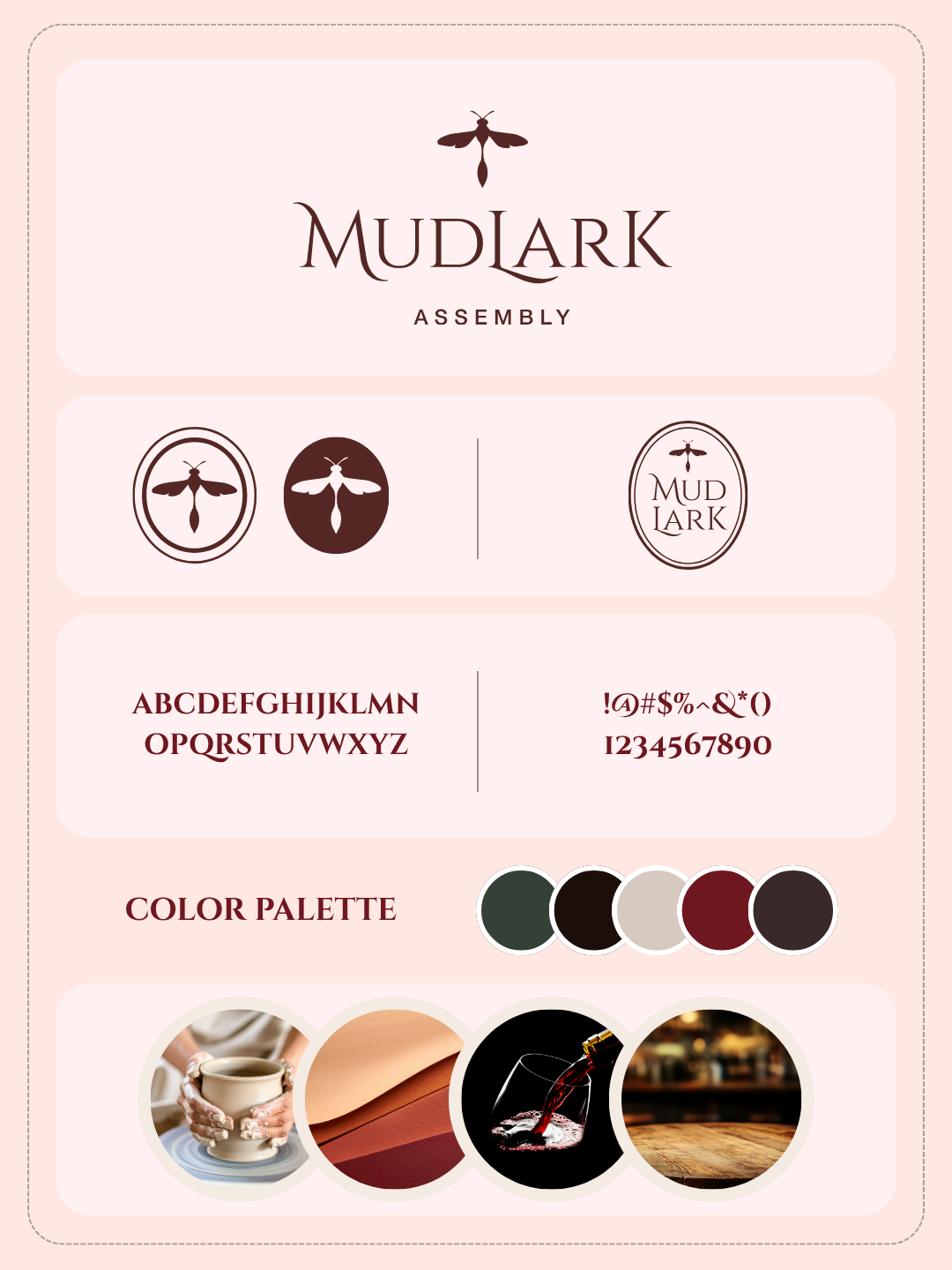
The visual identity draws inspiration from the tactile nature of clay, the rhythm of the pottery wheel, and the confidence of well-made objects.
A restrained serif wordmark is paired with a simple mud dauber icon, creating a balance between elegance and approachability. The earthy palette and editorial typography reinforce a brand that feels timeless, calm, and intentionally crafted.
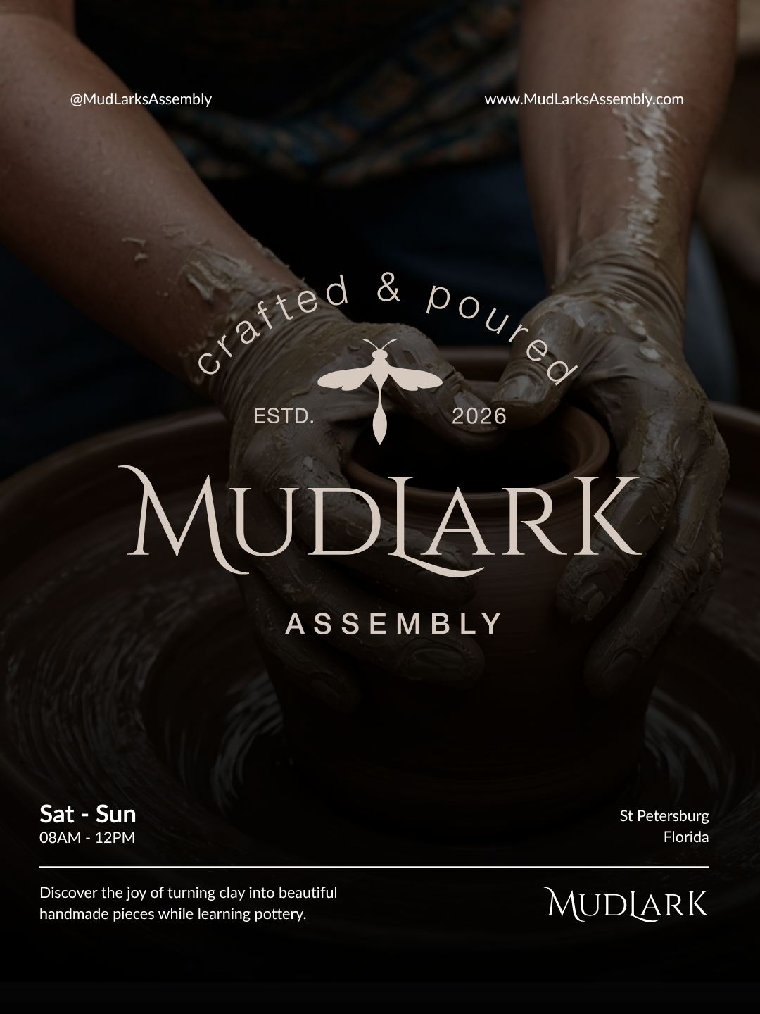
Every element was designed to feel as though it belonged in the studio itself—from signage and printed materials to digital experiences and merchandise.
Reflection
One of the things I enjoyed most about this project was designing for atmosphere instead of attention.
The goal wasn’t to create the loudest identity in the room—it was to create one that felt familiar the moment someone walked through the door.