

Ruckus Labs Brand Identity Concept
Role:
Brand Identity, Logo Design, Visual Exploration
Brief
Ruckus Labs is a concept brand exploring how a children’s maker space or STEM workshop could feel playful without becoming visually chaotic. The goal was to create an identity that captures creativity, experimentation, and a little bit of mischief while remaining simple enough to scale across signage, merchandise, digital products, and educational materials.
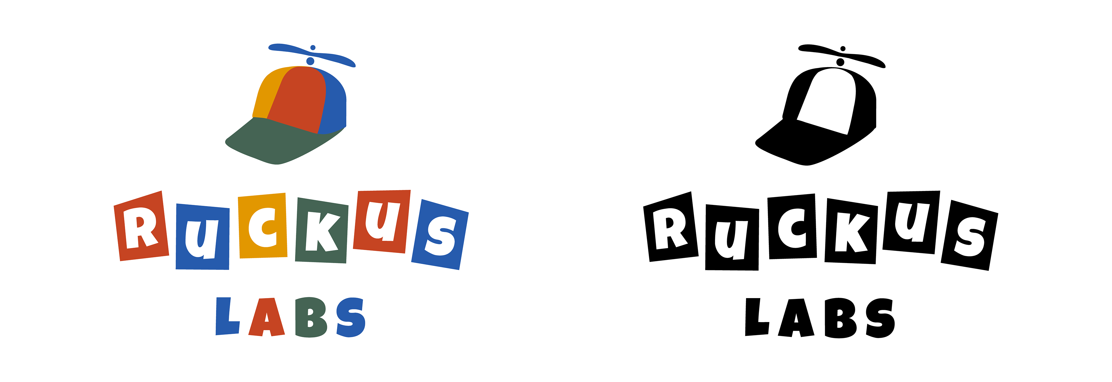
The final direction combines bold geometric typography with a playful sense of movement, creating a mark that feels energetic, approachable, and memorable.
Design Direction
The identity draws inspiration from building blocks, toy packaging, classroom creativity, childhood experimentation, and retro children's toys. Rather than relying on overly polished forms, the letterforms intentionally feel slightly imperfect—suggesting that curiosity, tinkering, and hands-on learning are part of the brand’s personality.
The simplified cap icon reinforces the playful tone while remaining versatile enough to become a recognizable brand mark across future applications.