

Brand Identity Exploration
Role: Brand Strategy · Visual Identity · Art Direction
Overview
Iron & Iris explores the intersection of strength and refinement.
The concept imagines a modern lifestyle brand rooted in craftsmanship—where industrial durability meets thoughtful design. The goal was to create an identity that feels confident and timeless without becoming overly masculine or traditional.
Every element of the system was designed to balance structure with softness, creating a brand capable of expanding across products, packaging, apparel, and digital experiences.
Design Direction
The identity draws its personality from contrast.
“Iron” represents resilience, precision, and craftsmanship.
“Iris” introduces growth, beauty, and optimism.
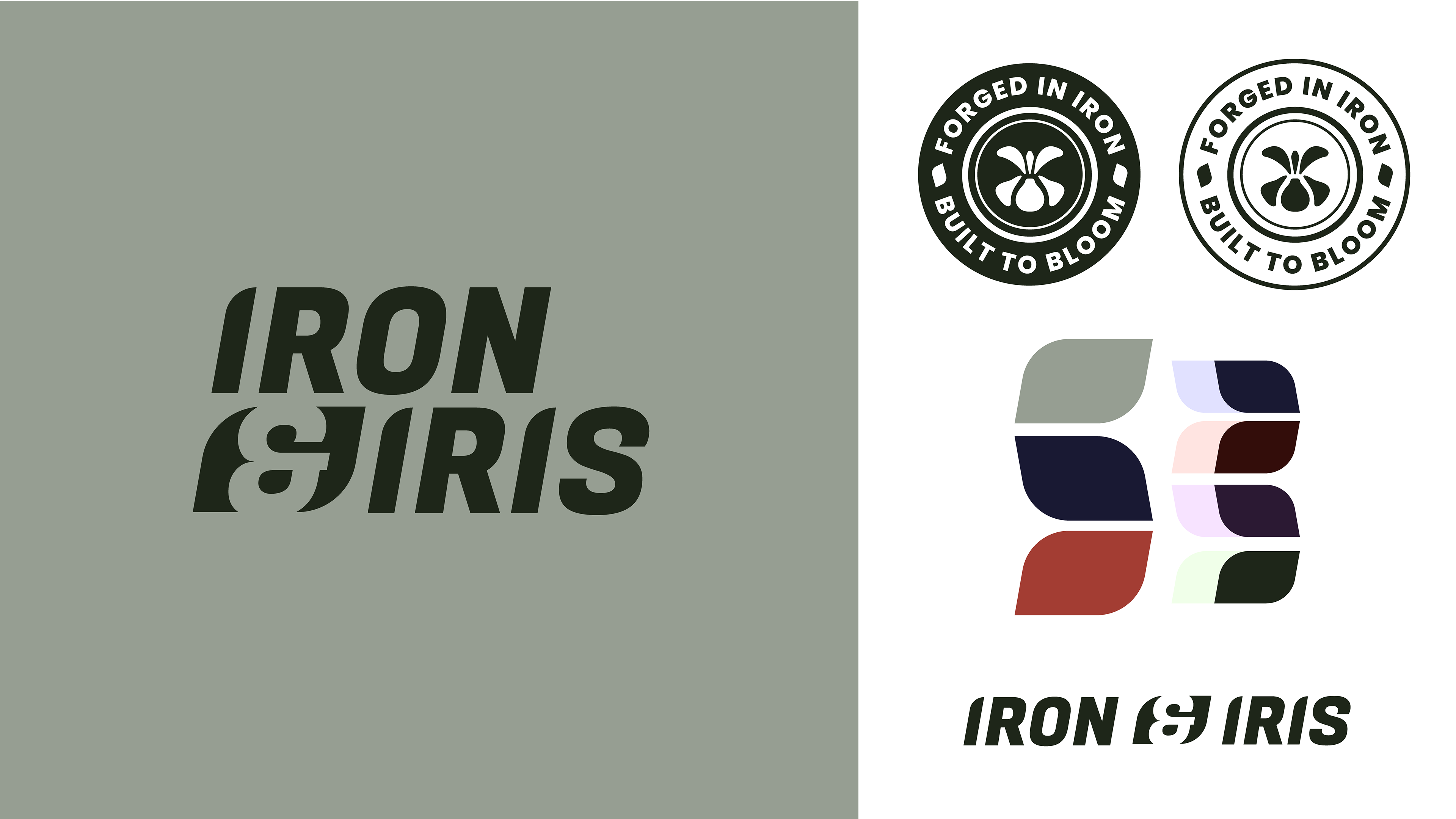
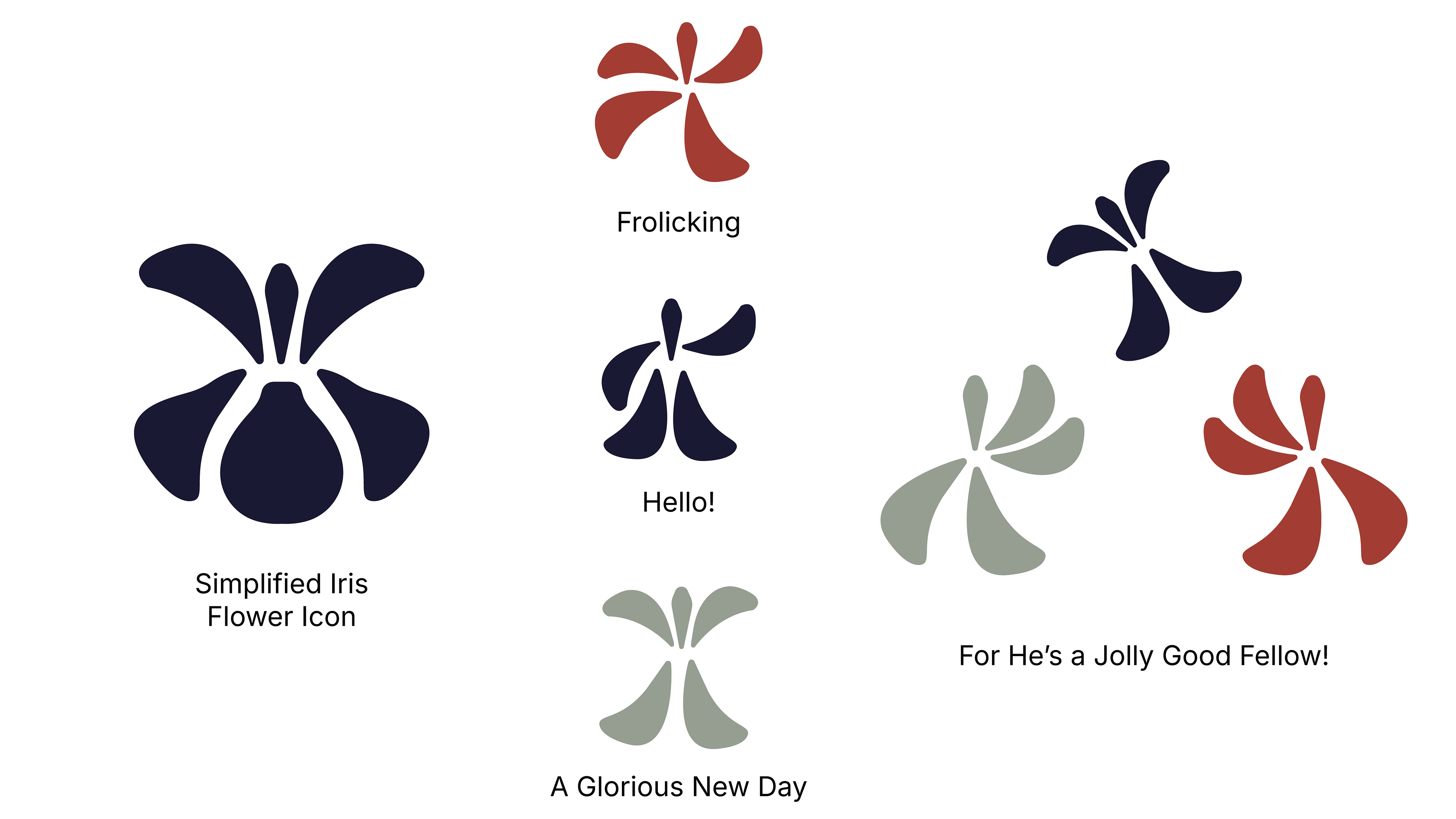
Rather than treating those ideas as opposites, the visual language brings them together through bold typography, restrained color, and a botanical symbol abstracted into a geometric brand mark.
The result feels distinctive without relying on decorative flourishes.
Building a Flexible System
From the beginning, flexibility was just as important as aesthetics.
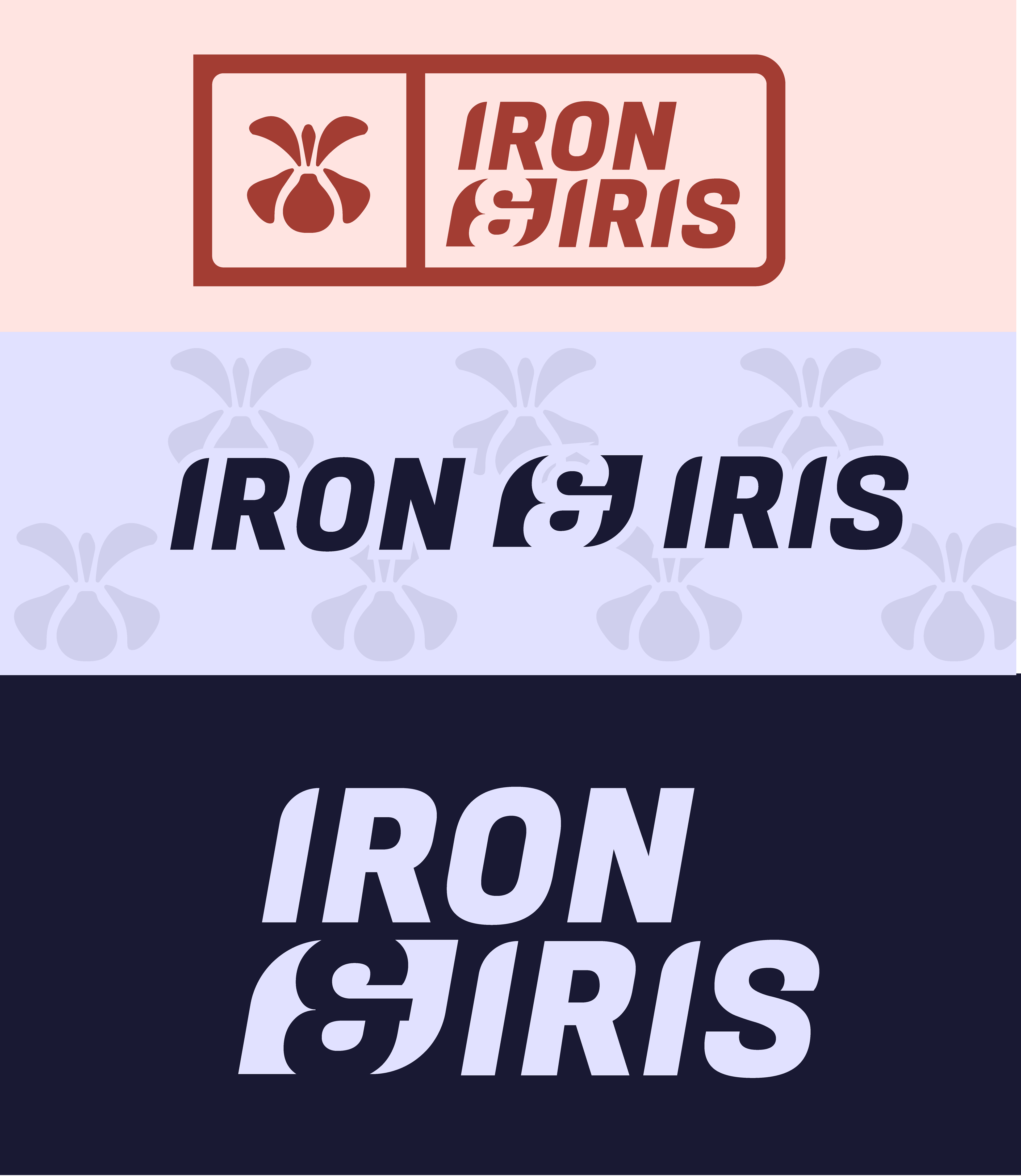
The identity was developed as a modular system capable of adapting across multiple applications while remaining instantly recognizable.
Rather than creating multiple disconnected logos, each component was designed to work together as part of one cohesive identity.
Reflection
One of the goals of this project was exploring how much personality could be created through typography and shape alone.
Instead of relying on illustration or ornamentation, the identity uses rhythm, proportion, and repetition to create something that feels modern, memorable, and built to scale.